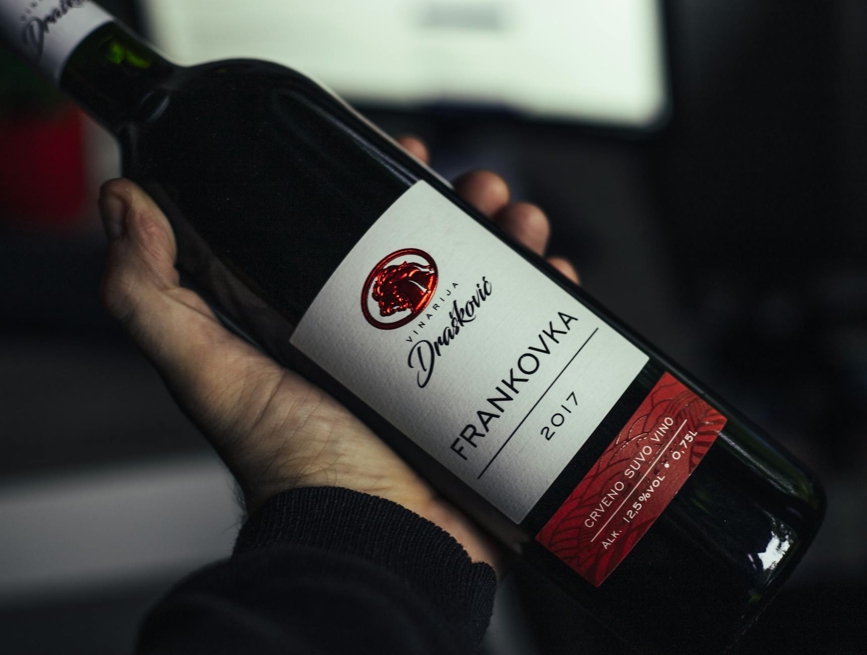
If you’ve ever found yourself reaching for that bottle just because the label looked fun, you’re not alone. Wine shopping sometimes feels like a dating app for grown-ups—swipe right on the most interesting face and hope for the best inside. Hidden behind every playful label, though, there’s a story and an unsung artist who helped make that bottle impossible to ignore.
Welcome to the little-known universe of wine label designers. These creative minds do much more than just slap stickers on glass. They blend colors, shapes, and stories, turning an ordinary bottle into a secret invitation to try something new. Curious about how a label can influence what you pour at your next dinner? Great. This post is for all the wine-curious adults who think a bottle’s look is half the fun.
To really get the joke or pick up on the subtle cues that designers slip into labels, it helps to know a bit about what those words and images are meant to signal. For a deeper peek into what all that fancy type and clever art really mean, check out this helpful guide on Understanding Wine Labels. Grab your favorite glass, and let’s meet the artful folks behind the bottles that catch our eye every time.
Who Are Wine Label Designers?
Before a bottle lands in your cart, the label’s magic has already done its work. Wine label designers are the behind-the-scenes talent, making sure every bottle pops off the shelf, tells a story, and stands out in a sea of sameness. With a sharp eye for detail and a knack for color and style, these creatives transform legal info and branding requirements into a little piece of shelf art—sometimes playful, sometimes classic, always on purpose.
What Wine Label Designers Really Do
Wine label designers do more than splash pretty pictures or snazzy fonts on a bottle. Their job blends art, marketing, psychology, and even a bit of lawyering. Here’s what a typical day in their creative corner looks like:
- Balance branding and regulations: Designers must fit all that legal stuff—alcohol content, origin, health warnings—in a way that never ruins the vibe.
- Capture the winery’s story: Each label is like a mini memoir, capturing the winery’s history, personality, and spirit with just a few colors and design touches.
- Influence your buying decision: Ever picked a bottle just because it “felt right”? Designers aim for precisely that—using color theory, fonts, imagery, and texture to grab your attention and tug at your emotions.
- Stay on trend: Just like fashion, label styles change. A designer might riff on vintage minimalism one year, then go wild with bold pop art the next.
You can see how labels communicate hidden messages in this guide on decoding wine label meanings.
Types of Designers: Artists, Studios, and Winery Insiders
Winery owners don’t always dream up those clever labels themselves. Instead, design brains come in a few flavors:
- Freelance artists: Some labels spring from the wild imaginations of independent illustrators, painters, or graphic designers. They add personal flair and quirky ideas.
- Design studios/agencies: Many wineries work with agencies known for bold branding. Studio teams bring resources and branding expertise and often work on entire brand overhauls, not just single releases.
- Winery insiders: Occasionally, someone on the inside—think the winemaker’s spouse, a marketing manager, or a local artist-friend—takes a hands-on approach. These labels can feel extra personal and one-of-a-kind.
For a deeper look at how visual storytelling works in wine marketing (not just the art but the psychology, too), VinePair’s feature on wine branding offers some tasty examples.
Skills and Backgrounds: What Makes a Great Label Whiz?
Wine label designers don’t have a “one-size-fits-all” resume, but a few skills help them stand out in this fancy club:
- Artistic chops: Drawing, illustration, or graphic design skills are non-negotiable. If you can’t sketch a grape to save your life, label design might not be for you.
- Brand whisperer: These designers can translate a winemaker’s vibe, story, or vision into a single eye-catching package. They’re part artist, part mind-reader.
- Nerd for detail: Typos or missing label elements? Not on their watch. Perfectionism counts, since wine labels face plenty of scrutiny from both legal folks and design critics.
- Marketing sense: Good label designers “get” what stops shoppers in their tracks and know how to make bottles irresistible, even at a glance.
- Open to collaboration: Working with winemakers, marketers, and compliance teams is part of the gig.
Curious what the life of a working wine label designer looks like? This behind-the-scenes Q&A with award-winning designer Michael McDermott pulls back the curtain. You’ll find no stuffy art speak—just real talk about creativity, deadlines, and, of course, wine.
You’ll spot the handiwork of great label designers every time you shop—just keep your eyes open and your imagination thirsty.
Why Wine Labels Matter So Much
Wine labels aren’t just stickers—they’re your first peek behind the glass. Long before corks pop, the label starts whispering clues about the wine’s personality and pedigree. A bottle’s label can spark a memory, set an expectation or pull you in like a bright book cover. While the world of wine can feel complicated, a playful or striking label makes things feel approachable and fun.
First Impressions: The Shelf Appeal
Scan any store aisle: hundreds of bottles, all hoping for a quick glance that turns into a sale. What breaks through the visual noise? A great label does. The right colors, fonts, and eye-catching details can make a $12 bottle feel like a work of art—and sometimes, it’s that curb appeal that gets the bottle off the shelf and into your cart.
Designers know first impressions matter:
- Shapes and visuals jump out in crowded displays.
- Texture and finishes beg for a touch, adding a sense of luxury.
- Even the paper quality or a wax seal can create a “pick me up” moment.
According to industry research, a well-designed label can even boost a wine’s perceived value and desirability. It’s not just about looking pretty; it’s classic psychology, as explored in studies on how wine packaging affects consumer decisions.
Storytelling in a Snapshot: Labels As Brand Ambassadors
A label squeezes a whole identity into one rectangle. Some hint at romance, others at wild nights, and a few want you to feel at home. But what every unforgettable label does is tell a story—sometimes in a single glance.
- An illustrated vineyard sketch? It says, “hand-crafted tradition.”
- Splashy modern art? That’s a wine ready for your next dinner party.
- Whimsical characters? You’re in for a playful experience.
Designers use every inch to hint at how this wine feels, tastes, and fits your vibe. Well-crafted labels become silent salespeople, wordlessly sharing the winery’s backstory and unique style every time you pick up the bottle. You can dive deeper into how wineries craft these visual stories in How Three Wineries Used Wine Labels to Tell Their Stories.
Labels and Wine Buying: Looks Count
Here’s a fun fact: many shoppers grab a bottle because they “just liked the label.” It might sound impulsive, but it’s science-backed. A slick label draws your eye, sets expectations, and can nudge you to try a wine you’ve never had before. Neuromarketing experts have even found that small label design changes influence choices, engaging your emotions and subconscious.
When you’re standing in front of dozens of bottles, you barely have time or energy to read every word. In those moments, you use the label as your shortcut:
- Attractive designs make selections feel less risky.
- Bold or classic styles signal whether it’s a party wine or something for a quiet night in.
- Clear labels help newbies feel less intimidated by all the choices.
If you want a quick tip on making sense of wine aisles without feeling overwhelmed, check out this guide on how to choose wine for any occasion. It’ll keep your decision-making as smooth as your favorite pour.
In short, wine labels don’t just hold legal fine print; they spark curiosity, pull you closer, and sometimes close the deal all by themselves. Next time you grab a bottle, take a second look. That clever label might just be why you picked it.
The Design Process: From Idea to Bottle
Ever wondered how a scribbled idea transforms into a label you just have to touch? The magic isn’t just in the final look; it’s in the wild, sometimes messy, but always intentional journey behind the scenes. Wine label designers juggle winery dreams, design inspiration, tricky fonts, and even the legal nitty-gritty to turn blank space into something unforgettable. Each label is a handshake, a wink, or a poetic hint waiting to be decoded. Here’s how that whole transformation unfolds.
Translating a Winery’s Vision
Designers don’t just chat with winemakers—they play matchmakers for brand and bottle. It starts with understanding what makes the winery tick:
- Is it bold and rebellious, or steeped in old-world tradition?
- Does the winemaker want playful or poetic?
- What’s the backstory, and what feeling should you get at first glance?
Top label pros meet with owners, taste the wine, and soak in the landscape (sometimes literally, if the vineyard has a muddy harvest). They collect family stories, local myths, and even handwritten notes. This isn’t just art—it’s detective work with a splash of marketing. Want to see how that comes alive on shelf after shelf? Eater’s look at what goes into designing a wine label fills in the blanks between vision and reality.
Finding Inspiration: Region, Grape, Mood, and More
That striking label didn’t spring up from thin air. Designers pull from every corner of the wine’s story. Think of it like a sommelier picking flavor notes—only here, it’s color, imagery, and attitude.
- Region: Sun-baked hills or misty coasts, the land makes its way onto the label in textures, patterns, or subtle cues.
- Grape: Some grapes scream for silky fonts and moody colors; others invite bold lines or playful shapes.
- Mood: Is this wine the star of the party or a fireside companion? The answer drives everything from art to finish.
- Heritage: Family crests, vintage maps, and nods to tradition all shape the final look.
Designers sometimes build a mood board filled with local elements: stone walls, wildflowers, and a favorite family dog. Every scrap counts when storytellers are at work.
Steps in the Journey: Sketches, Feedback, Fonts, and Finishing Touches
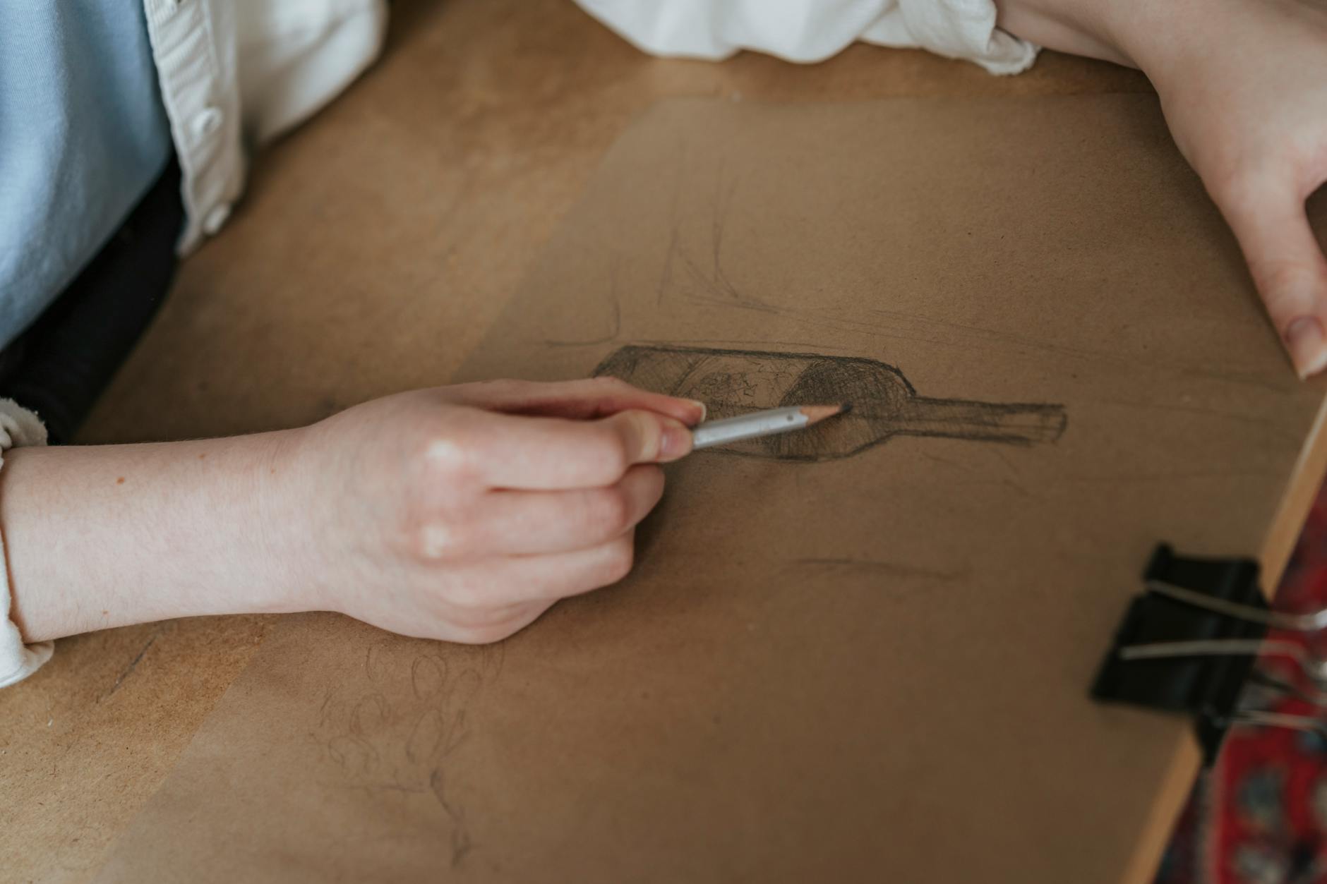
Turning ideas into art is more than just doodling. Designers follow a step-by-step process, tweaking and rethinking as they go:
- Rough sketches: Quick freehand drawings help narrow down significant concepts.
- Digital drafts: Sketches morph into digital layouts. Here’s where color, imagery, and fonts get serious.
- Feedback rounds: Winemakers, marketers, and sometimes entire families chime in. Opinions change, and the design evolves.
- Final tweaks: Fonts are finessed, colors sharpened, and last-minute touches add sparkle (think: embossing or foil).
- Mock-ups and physical samples: Some designers use digital tools to show bottles in 3D. There might even be a printed sample, letting the team see and touch the label before the final print run.
Typography can make or break shelf appeal. Are you channeling old-school romance or a bold, trendy style? Playing with spacing, typefaces, and colors is half the fun—and all about making the bottle jump out in the wine aisle.
For a deeper dive on how designers blend each element, check out this wine label design guide, which unpacks the creative journey from first ideas to finished product.
The Fine Print: Legal Must-Haves and Printing Choices
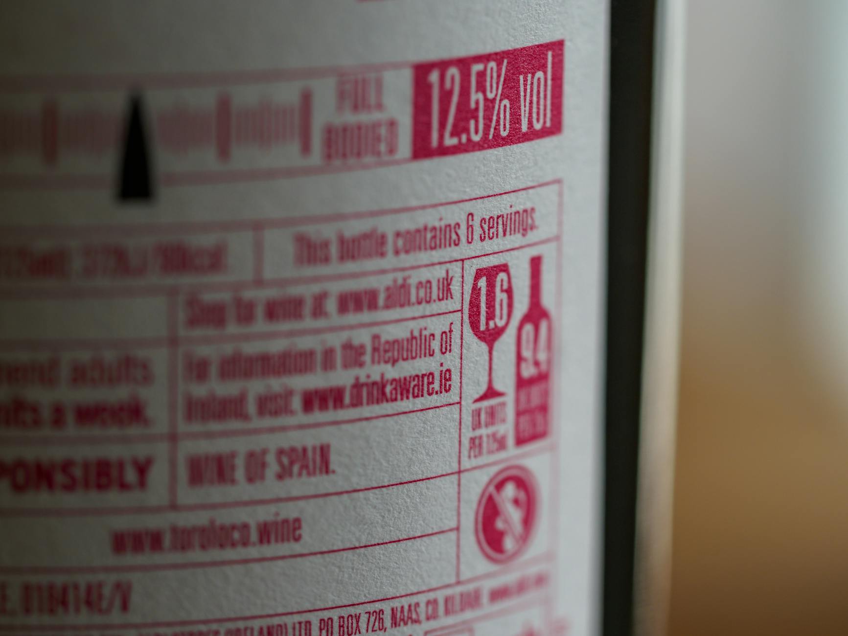
Once a design is set, there’s one more hurdle: legal rules and printing wizardry. Labels must fit every state or country’s standards. Most bottles need basic info like:
- Brand and vintage
- Origin (where the wine was made)
- Alcohol content
- Health warnings (yep, even small-batch rosé needs them)
Miss a key detail? That label could get rejected and sent back to square one, which is why every designer develops a sixth sense for regulation. Printing adds another layer of magic—or headache. Designers choose paper textures, foils, embossing, and glossy or matte finishes. The label’s feel needs to match its look, and the choice can elevate a basic design or make it unforgettable.
For a look at why printing details are more than just fussiness, peek at this breakdown on wine label design finishes that boost shelf appeal.
The design process is part art lab, part compliance office, and all about getting that split-second “pick me” moment in the shop aisle. This mix of creativity and rule-following makes wine label design an oddball (and very fun) journey from doodle to dinner table.
Styles and Trends in Wine Label Design
The world of wine labels is a playground for bold experiments, quirky statements, and the occasional “wait, is that a cat surfing a pizza?” moment. Designers aren’t just following the pack; they’re making shelves a gallery of personality, from all-white minimalism to neon maximalist pops. While classic elegance still charms, new trends are shaking up what catches your eye at the shop. Let’s get into the current styles that are making bottles irresistible.
Minimalist or Maximalist: What’s Hot?
Over the last couple of years, we’ve seen two extremes make waves: sleek minimalism and wild maximalist flair.
- Minimalist labels ditch the clutter. Think clean fonts, lots of white space, and just enough color to stand out. These bottles shout “quality” without screaming.
- Maximalist designs are color explosions, with bold type, illustrations, and collages that snag your attention with pure energy.
Both styles pop for different reasons:
- Minimal labels ooze sophistication, a smart pick for anyone who loves the look of a modern art museum.
- Maximalist labels pull in the party crowd or anyone with a sense of humor. They’re mix-tape covers for the wine shelf.
The pendulum keeps swinging. As consumer tastes shift, you’ll find more winemakers daring to show personality or dial down for elegance. Curious about how designers track these style shifts? This feature on Wine label design predictions for 2025 gives an inside look at what’s next in minimalist and maximalist trends.
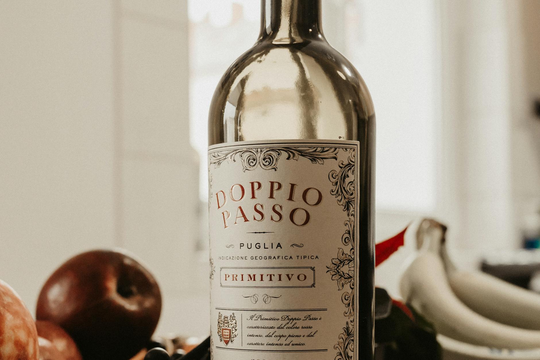
Artful Labels: Classic, Playful, and Standout Shapes
Wine labels are flexing beyond rectangles. Designers use die-cut shapes, embossed textures, and illustrated vignettes to tell a brand’s whole story at a glance.
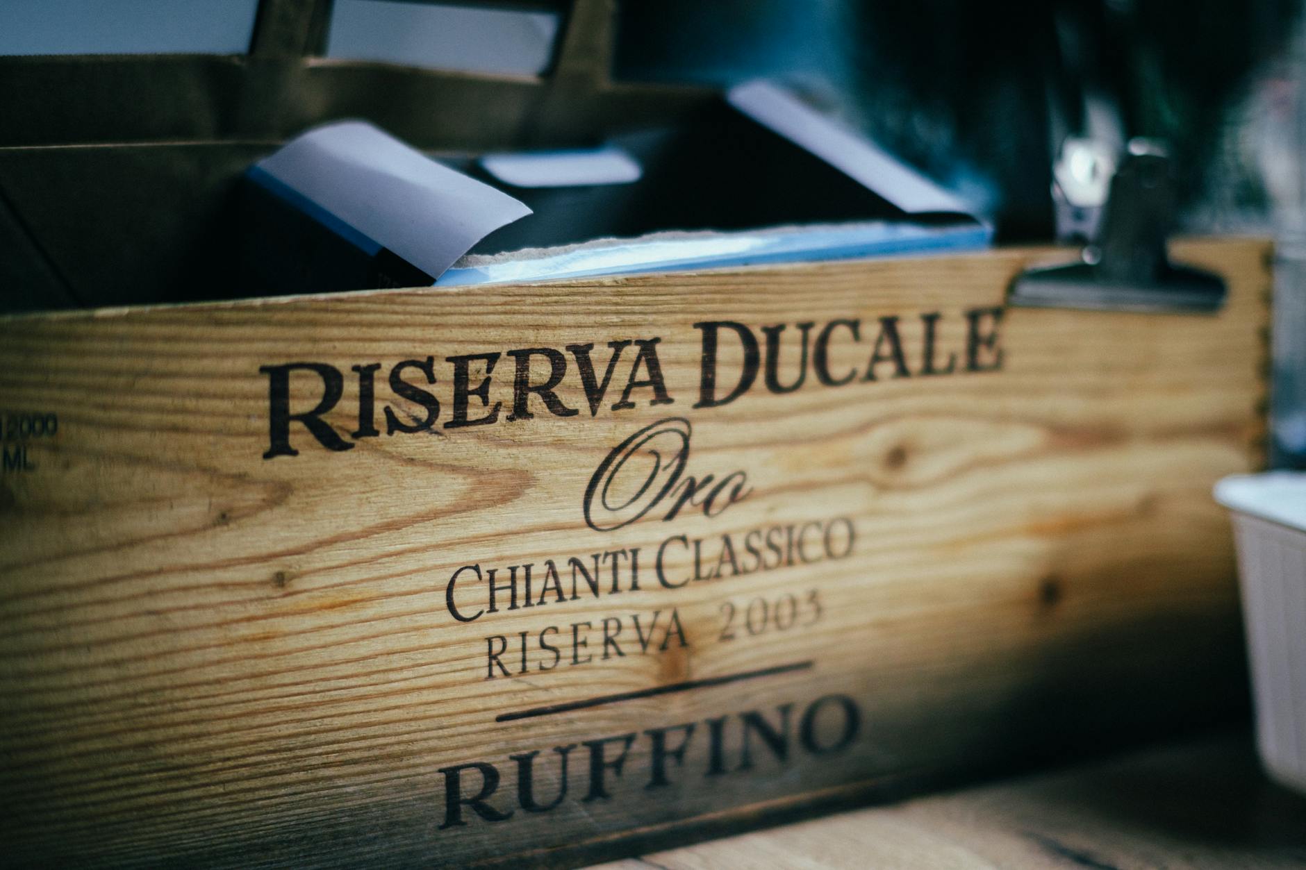
Classic choices still work—crests, calligraphy, and aged parchment textures appeal to tradition lovers. But then you have:
- Playful labels: Animals, cartoons, puns, and even day-glo doodles make the bottle feel like a conversation starter.
- Unusual shapes: Circular labels, asymmetrical cuts, or even wrap-around art break up the grid and catch a shopper’s eye.
- Collages and hand-drawn art: Blurred watercolors, layered graphics, or moody sketches bring artistry and mystery to the shelf.
Looking for inspiration or some jaw-dropping examples? Check out these wine label designs that leave you salivating, where playful meets refined in delicious, memorable ways.
Trends to Watch on the Shelves
The label aisle right now is a circus of trends, and chances are, next season will be just as wild. Here’s what’s catching shoppers’ eyes:
- Hand-drawn illustrations: These infuse bottles with warmth and craft.
- Sustainable materials: Recycled paper, plant-based inks, or even labels that double as coasters.
- Instagram-ready looks: Designs begging to be snapped and shared—think bold colors, punchy type, and quirky graphics.
- Hidden jokes or “Easter eggs”: Codes for extra info, tiny hidden images, or playful wine pairing tips tucked inside the design.
Want a wider snapshot? A Field Guide to the Latest Trends in Wine-Label Design is packed with label trends that range from splashy to mysterious.
User-Friendly and Fun: Easy-to-Read Info and Quirks
Designers know no one wants to squint at eight-point type after a long workday. Today’s smartest labels blend utility and delight:
- Clear hierarchy: Big, easy-to-spot name and grape type.
- Short, punchy tasting notes or food pairings that sound like your fun friend describing wine, not a textbook.
- Quirky details: QR codes to tasting videos, clever jokes, or illustrations that double as serving advice.
Labels these days aren’t just pretty—they’re helpful. That means finding the grape, style, and even serving temp is simple. Plus, the best labels drop an inside joke or pun you’ll only spot at home. For more tips on decoding what info actually matters, visit the guide to decoding wine labels.
In the world of wine, a label’s look is your first clue—so why not make it clever, gorgeous, or just plain fun?
Notable Wine Label Designers and Memorable Labels
Behind every show-stopping wine label is a designer or agency that dreamed big and colored outside the lines. These trailblazers don’t just decorate, they set trends, challenge the old rules, and make bottle shopping feel like hunting for modern art. Some names and labels leap off shelves and stick in your memory (sometimes literally, thanks to clever textures or daring designs). This section gives a peek into the minds behind the magic, the labels that spun tradition on its head, and a few real-world stories of memorable bottles done right.
Spotlight on Standout Designers and Agencies
Some designers and agencies have made such a mark on the wine world that their work almost needs a gallery wall. Here are a few stars worth knowing:
- Stranger & Stranger: This London/New York agency didn’t just shake up the wine aisle—they threw it a wild party. Known for pushing the envelope, their labels blur the line between packaging and collector’s art.
- Studio Ethur Ethur: This California team brings playful, vibrant energy to each bottle. They specialize in offbeat, memorable concepts that make every bottle an icebreaker at the table.
- Anagram Design: With a keen sense of simplicity and mood, this award-winning studio balances elegance and modern playfulness. Their work can be both understated and unforgettable.
These designers are often behind the bottles that linger in your mind, whether you’re a seasoned sipper or a casual shopper. For more bold design moves and the latest creative shenanigans, take a peek at what’s trending in the Wined Up Daily Blog.
Labels That Broke the Mold
A handful of labels have made people rethink what a wine bottle should look like. Here are just a few examples that made headlines and piled up design awards:
- 19 Crimes: Their labels use augmented reality. Scan one with your phone, and the illustrated convict “talks” to you about their story. Few wines have ever sparked this much chatter.
- The Prisoner: With its moody, fine-art etching and bold text, The Prisoner broke away from traditional vineyard sketches. The label draws you in with a story and an edge.
- Mollydooker: Known for their bright colors and cartoonish whimsy, these bottles aren’t shy. They jump off the shelf (and double as conversation starters).
Bottles like these prove you don’t need to stick with old-timey scrolls or subtlety. Sometimes, a label can be as much fun as the wine itself.
Quick Case Studies: The Stories Behind the Labels
Let’s pull back the curtain on three eye-popping labels and see how they came to life.
- Field Recordings “Fiction”:
-
- This label came from real-life snapshots arranged collage-style, nodding to winemaker Andrew Jones’s decades of vineyard scouting. The design feels like a scrapbook come to life and tells a visual story about the people and places behind the wine.
- Bone Dry by Bird Dog Wines:
-
- Instead of following the “serious red wine” script, this label uses bold, skeletal illustrations and tongue-in-cheek copy. It’s playful, a bit punk, and perfectly signals the crisp, fresh style inside.
- The Federalist:
-
- Inspired by classic Americana, The Federalist’s labels showcase historical figures like Benjamin Franklin. The sturdy typography and vintage currency vibes help the bottles feel both familiar and striking.
If you want to see how stripping away labels can even the playing field (and remove all bias), check out the tips on running a Blind Wine Tasting Party Guide. It’s proof that while labels wow us, there’s always something fascinating beneath the surface.
Just like a great wine, the best labels have layers. They stand out. They spark curiosity. And they keep us coming back for another look—and maybe another glass.
How Designers and Wineries Team Up
Before that splashy label ever hits a bottle, there’s a backstage dance between creative brains and business minds. Designers and wineries join forces, balancing art with sales targets, old-world charm with bold new ideas, and one-off wow with long-term branding plans. This success story is built on collaboration, trust, a few wild ideas, and plenty of trade-offs.

Great design isn’t about “making it pretty.” Designers work elbow-to-elbow with winery teams, marketers, and even accountants. They know the label must:
- Pop off shelves—even if sandwiched between 200 other bottles
- Signal price, grape, and mood in a blink
- Satisfy all the nitty-gritty legal stuff
This team-up is a juggle act. Designers push boundaries with wild sketches, while the winery asks, “Will it help us sell more?” It’s a back-and-forth process with lots of sketches, edits, “what ifs,” and the occasional veto. A well-designed label acts as a bottle’s business card and its slick advertisement; all rolled into one small space.
Want more tips on what sells wine (beyond a great label)? Dive into this list of wine branding strategies that boost sales.
Tradition Meets Innovation
Many wineries sport loads of history. Their founders’ faces, dusty vineyard maps, and vintage typefaces might get a cameo on the label…and for good reason. Consumers trust what feels tried and true. Still, designers love to shake things up.
Here’s where things get spicy:
- Some bottles nod to old roots with heraldic crests or script fonts that wouldn’t look out of place a century ago.
- Others take tradition and add a rebel twist: neon colors, quirky cartoons, even hidden jokes inside the cork.
This tug-of-war keeps wine interesting. People fall for bottles that hint at a legacy, but if you want to turn heads, a touch of bold never hurts. The best designer-winery partnerships find that sweet spot, blending respect for heritage with fresh ideas that tempt even the most loyal old-school fans.
For creative sparks mixing past and future, check out Food & Wine’s story on modern label trends with classic twists.
Building a Brand: Designers’ Long-Term Role
The first label is just the start. Designers often stick around for the long haul, helping wineries:
- Reinvent the look for new releases
- Tweak labels for seasonal or specialty bottles
- Stay ahead of style shifts (when minimalism gives way to maximalism, or vice versa)
A true designer-winery partnership means having a creative pro in your corner, ready to jump in when you’re launching a sparkling rosé or going all-in on a limited-edition blend. As trends shift, designers keep the brand’s story clear, fun, and instantly recognizable. These partnerships help small wineries punch above their weight—consistent branding on every bottle gives an instant signal of quality, no matter the vintage.
Feeling inspired to spot the details that make a wine brand unmistakable? You’ll find more about branding genius at play in this curated lineup of labels that tell unforgettable winery stories.
A lasting designer-winery relationship is a bit like a good vintage: richer, more satisfying, and worth coming back to year after year.
The Impact of Good (and Bad) Label Design
Ever stood in the wine aisle and felt your eyes dart from one bottle to the next? That’s no accident. The magic of label design can make one bottle the star and another fade to the back row. A well-designed label isn’t just dressing, it shapes a wine’s first impression, guides split-second choices, and even creates collectibles that fans hunt down. But when things go sideways, the fallout can hit everything from sales to a winery’s street cred. Let’s unpack how great (and not-so-great) labels shape the wine you buy, sell, and stash away.
When Labels Boost Sales
Stacked shelves can blur together, but a strong label grabs attention like a neon sign at midnight. Good labels draw the eye and nudge buyers to reach for a bottle, even if it’s not a familiar brand. Here’s how winning designs work their magic:
- Clarity wins: Clear type, bold colors, and memorable graphics stick in your mind—and sometimes in your shopping cart.
- Brand identity: A snazzy label often hints at what’s inside. Rustic? Probably old-world and earthy. Splashy pop art? Expect a wine with attitude.
- Instant trust: Smart design says, “We care about the details.” When shoppers see a polished label, it boosts confidence—even before reading a single word.
- Social influence: In today’s world, a bottle that looks great in a selfie or on a dinner table is already doing half the marketing.
A label’s effect doesn’t stop at retail. Restaurants and wine bars often feature bottles with artistic or standout labels front and center, giving brands free exposure and extra buzz. According to some deep dives into the impact of packaging and design, a sharp label can even help a wine outsell its less-flashy neighbor, regardless of price or pedigree. For a rundown of label wins and flops, check out this quick-hit Wine Labels Old & New – The Good, The Bad and The Ugly review for real-world examples.
When a Label Flops (And What Happens Next)
Not every label gets it right. Some designs get lost in the visual clutter, while others deter buyers with confusing fonts or unusual colors. Here’s what a so-so (or downright bad) label can trigger:
- Shelf invisibility: If a label blends in or looks dated, even a great wine gets skipped.
- Mixed signals: Clashing designs, hard-to-read info, or odd images can make people wonder, “Who is this wine for, anyway?”
- Perception problems: A sloppy label erodes trust, making shoppers second-guess quality—or price. Sometimes, even a cheap bottle tries to look expensive and backfires.
- Legal headaches: Miss one regulation, and a winery can incur considerable costs pulling bottles off shelves or slapping on new labels. Mistakes don’t just dent ego—they dent budgets.
But it’s not all doom and gloom when a label misses the mark. Wineries bounce back by following a familiar script:
- Gather feedback: Retailers and drinkers aren’t shy about what works (and what doesn’t).
- Pivot the design: Sometimes a mid-season update, or total overhaul, is needed. Partnerships with skilled designers help wineries avoid repeat stumbles.
- Leverage the drama: Some brands even embrace ugly-label flops for marketing stunts or “limited edition” laughs.
And if you’re curious about dos and don’ts to sidestep classic mistakes, check out the Dos and Don’ts of Wine Labels for the scoop.
Wine Collectors and Coveted Labels
What makes a wine label worth chasing down? For collectors, it’s not always about what’s in the bottle. Sometimes, the label turns a wine into a showpiece conversation starter, a status symbol, or even an investment.
Here’s why some labels become collectible gold:
- Iconic art: Labels created by famed artists or linked to big brands (like the legendary Mouton Rothschilds adorned by Picasso or Warhol) become instant collector’s items.
- Limited editions: Short-run bottles with unique artwork, quirky collaborations, or rare print runs drive buzz in wine communities.
- Design breakthroughs: When a label shakes up norms—like innovative textures or unexpected shapes—it can create a cult following.
Some bottles never see the inside of a glass because wine fans snap up anything with a must-have design for their own collections. Over the decades, a few wineries made their mark as legends of label design—a topic explored in guides like Best Wine Label Designs: Keith Haring, Dolce & Gabbana and More.
For those eager to spot collectible cues or impress their friends at the next dinner party, it’s smart to brush up on what turns a basic bottle into a sought-after gem. The next time you pick up a bottle, you might be holding tomorrow’s art piece—or just the best dinner table conversation starter of the week.
DIY Wine Label Design: Tips for Hobbyists and Small Producers
Not a giant winery? No problem. Designing wine labels at home is much more fun than it sounds, and anyone from backyard vintners to garage winemakers can give their bottles a personal stamp. Whether you’re gifting bottles to friends or selling at the local farmer’s market, a good label turns “homemade” into “hey, that looks pro!” Let’s break down how hobbyists and small producers can make their bottles pop—without a big-studio budget or a degree in fine art.
Starter Tips for Eye-Catching Labels
Most designers keep a foot in both camps. Digital does the heavy lifting, but tradition brings the charm. The real “king” is whichever tool helps the label shine brightest on the shelf.
Conclusion
Every wine shelf is a gallery, and every favorite bottle owes part of its charm to the creative folks holding the sketchpads and color swatches. Wine label designers bridge the gap between “just another bottle” and one you want to show off at dinner. They tell bold, funny, or heartfelt stories with ink, paper, and a little magic. Whether you’ve ever picked a bottle because it made you smile or snapped a photo before pouring, you’ve met their work. Next toast, raise your glass to the hidden artists behind the labels. Let your eyes shop first; sometimes, the best surprises come wrapped in a sticker. Thanks for joining the fun. Found a label you can’t stop talking about? Share your story and keep the conversation going.